May 22nd, 2023
Do Chart Patterns Matter? - A Machine Learning Inquiry into Stock Performance
Introduction
In the world of finance, stock chart patterns are often regarded as a roadmap to future price performance. They serve as a visual representation of market sentiment and are used by traders and investors to make informed decisions. But do these chart patterns truly matter? And can their effectiveness be quantified to yield a more predictive and profitable trading strategy? This report aims to explore these questions, employing machine learning techniques to delve into the intriguing intersection of finance and technology. We seek to understand whether certain types of stock chart patterns outperform others and if machine learning can aid in their identification, thereby providing a fresh perspective on stock performance prediction.

Free PDF, Trade Data & Stock Chart Images
Get this study in PDF format, along with CSV trade data, cluster-organized stock images, plus average images per cluster/sub-cluster. Pay what you want!
Download NowBackground
This report builds on our previous work, where we presented a systematic approach for studying and analyzing stock market movements, primarily focusing on momentum breakout setups. That investigation served as a comprehensive journey into historical market data, aiming to develop a framework that would provide a deeper understanding of the various factors influencing trade performance. Key dimensions explored included seasonality, price, volume, consolidation, and Average Daily Range percentage (ADR%). The aim was not to provide specific trading recommendations, but rather to contribute to the broader knowledge base around stock market dynamics.
In our previous study, we developed a methodology that involved careful data sourcing, along with defining specific entry and exit strategies and other parameters, all aimed at providing a robust analysis of market behaviors. The findings from this analysis were then used to elucidate trends and relationships, contributing valuable insights for future research and decision-making processes.
Purpose
Building on this foundation, the current report takes a further step to examine a central question: Do certain types of charts perform better than others, and can machine learning help us identify them? Given the ubiquity of chart patterns in trading and investing, understanding the relationship between these patterns and stock performance could offer significant benefits to market participants. This report thus aims to leverage machine learning techniques to explore this question in depth, with a focus on identifying high-performing chart patterns.
To facilitate this study, we have developed an open-source project, available at GitHub. This project has been instrumental in both the data collection and the machine learning analysis stages of this research. It stands as a testament to our commitment to transparency and reproducibility in research, and we encourage interested readers to explore and build upon our work.
By the end of this report, we hope to not only present our findings but also contribute to the broader discourse around the utilization of machine learning in financial markets. It's important to reiterate that our objective is not to offer financial advice, but to foster a deeper understanding of the factors driving market performance and how machine learning can aid in decoding them.
Table of Contents
Methodology
All code in this study was executed on a MacBook Pro, 16-inch, 2021 model. The computer is equipped with the Apple M1 Pro chip and 32GB of memory, providing modest yet ample computational resources for handling the data-intensive tasks involved in this analysis.
Data Collection
The data collection process for this study follows similar criteria to our previous research. Our data set comprises historical stock data, including both listed and, notably in this study, delisted stocks, providing a comprehensive view of the market dynamics. We believe the inclusion of delisted stocks will offer a more complete and unbiased picture of the overall market behavior, as it accounts for companies that may have underperformed or gone bankrupt. The data set covers a broad time frame, up until early April 2023, ensuring we have a wealth of information to support our machine learning analysis. We made a minor adjustment by increasing the minimum ADR% from 3 to 3.5. This change aimed to slightly reduce the number of trades we work with while maintaining a reasonable level of trade variation. This data collection approach has been carefully designed to ensure a robust, wide-ranging dataset that can support our investigation into the relationship between stock chart patterns and performance.
Running the data collection process on our machine took approximately 29 minutes to download the stock data, including historical timeseries. The subsequent backtesting process and populating the trades table took just under 4 minutes. These times can, of course, vary based on network conditions and computational resources.
Chart Image Preparation
The chart image preparation process is designed to convert the collected historical stock data into a visual format that can be analyzed using machine learning. The entire process is implemented in Python, and it involves the use of several popular data science libraries such as pandas, mplfinance, and Pillow.
The first step involves preparing the data for plotting. The stock data, comprising of open, high, low, close, and volume values, along with the respective dates, is converted into a pandas DataFrame. This data represents up to 200 daily candles leading up to, but not including, the entry date. This setup provides a complete visual context of the stock's performance before a trade entry is made. To ensure the data is in the correct format for plotting, numerical data types are converted to float, and the dates are converted to datetime objects. This meticulous data preparation allows for a precise and accurate visual representation of the market setup before the trade entry.
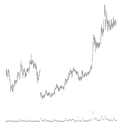
The second step is to plot the chart. This process involves the use of mplfinance, a library specifically designed for financial data visualization. Instead of traditional candlesticks, we use OHLC (Open, High, Low, Close) bars for depicting price movement, as this method provides a compact yet comprehensive view of price data. Similarly, volume is integrated into the chart as a simple black dot, maintaining a minimalistic approach. The charts are designed to be as clean as possible, with grid lines removed and all elements, including the OHLC bars and volume indicators, plotted in black. This design philosophy serves a dual purpose: it encapsulates all the necessary price and volume information in a small amount of pixels for efficient machine learning processing, while still remaining visually interpretable by humans for validation and interpretability of the results.
The next step involves saving the plotted chart as an image file. Each chart image is saved as a .png file, with the filename comprising the stock's symbol and a unique identifier. The image is then optimized and converted to grayscale using the Pillow library, a powerful library for image processing in Python.
Finally, to prevent memory leaks, the Python plot is closed after each image is saved.
This process is repeated for each trade in the database, with the help of the ThreadPoolExecutor from the concurrent.futures module to manage multiple workers and process the trades concurrently. This approach allows us to efficiently process a large number of trades, reducing the overall computation time. As each trade is processed, a progress bar is updated to keep track of the overall progress.
On our machine, the task of plotting the stock charts took about 2 hours and 12 minutes. This includes preparing the data, plotting the charts, and saving the images. This computational intensity underscores the amount of data being handled and the complexity of the chart creation process.
All of this code is neatly encapsulated within an accompanying open-source project, available at GitHub. The project serves as a comprehensive toolkit for conducting this study, providing both the data collection and chart image preparation functionalities. This not only ensures reproducibility of the study but also offers a valuable resource for those interested in further exploring the potential of machine learning in financial market analysis.
Chart Clustering
The next crucial step in our study is image clustering, a process that allows us to group similar stock chart images together, thus identifying common patterns. We employ machine learning techniques to achieve this, taking advantage of the powerful Scikit-learn library.
The first stage of this process involves the preparation of our image data for clustering. We begin by loading all the images from the directory, converting each image into a feature vector by flattening it. Given the temporal nature of our stock charts, we apply a weighting scheme to the feature vector, assigning more importance to the most recent data (right side of the image). The idea is to emphasize patterns close to the entry date, as they should be more relevant.
After preparing the image data, we standardize it to ensure that all features have the same scale, which is crucial for the clustering process. We then divide our data into two parts, using 20% for training our clustering model and the remaining 80% for prediction.
We use the MiniBatchKMeans algorithm for clustering due to its efficiency with large datasets. We train the algorithm on the smaller subset of our data and then use it to predict the cluster assignments for the remaining images.
Once the cluster assignments are predicted, we update our database with this information, associating each chart image with its respective cluster. For ease of inspection, we also organize the images into separate folders according to their assigned clusters. This setup enables anyone to quickly browse through the images and observe common patterns within each cluster.
The process of clustering the stock charts, which involves loading and preparing the image data, standardizing it, and updating the database with cluster labels, was completed in about 1 hour and 10 minutes on our machine. Despite its computational intensity, this crucial step allows for the grouping of similar chart patterns together, paving the way towards investigating our central question: Do certain types of charts perform better than others?
Cluster Visualization
The creation of representative images for each cluster, otherwise known as "Cluster Visualization", is a crucial step for enhancing the interpretability of our clusters. This process involves averaging all the images within a cluster, highlighting the darker areas for improved visibility, and removing the gray background for enhanced clarity. It's a vital step towards better understanding and interpreting the patterns within each cluster.
To generate a representative image for each cluster, we utilize a function that averages all the images within a cluster. This function reads all image paths in a given folder, initializes an empty array of the same size as the images, and then iteratively adds each image to the average after converting it to float32 type. After all images have been added, the average image is normalized and converted back to uint8.
As we are working with grayscale images, certain areas might not be easily distinguishable. To address this, we employ a method to highlight the darker areas of these grayscale images. The function highlight_darker_areas calculates a local mean threshold for each pixel using the rank.mean function, which effectively represents the average pixel value within a disk-shaped neighborhood around the pixel. It then creates a mask of areas where the original image is darker than this local mean. After converting the mask to uint8 and scaling it to the range [0, 255], the original image is blended with the mask to enhance the visibility of darker areas.
However, these images usually have a gray background that we would prefer to remove for better visual clarity. We achieve this using the remove_gray_background function. This function creates a binary mask where the image is darker than a specified background threshold. The original image is then overlaid with this mask, setting pixels where the mask is True to the original image values, and others to white.
Finally, the average image with highlighted darker areas and no gray background is saved to a specified output path. This process is repeated for every cluster of images.
On our specified hardware, this entire operation takes an impressively short time of approximately 17 seconds. Despite the brief execution time, this step provides substantial value, allowing us to visualize and interpret the common characteristics of each cluster.
Sub-cluster Analysis
In our final step, we further refine our understanding of chart patterns by performing a "Sub-cluster Analysis". This process involves dividing each of our initial clusters into sub-clusters. This allows us to capture more specific patterns within each cluster, potentially increasing the precision of our subsequent analysis.
To achieve this, we apply a similar approach to what was done in the clustering of the entire image dataset. Each cluster is separately subjected to a clustering process, which results in a set of sub-clusters. After this, similar to the previous step, average images of each sub-cluster are created to allow for visual interpretation.
This iterative clustering process enables us to delve deeper into the pattern structures present in our data. Even though it's similar to previous steps, the significance of this approach lies in its ability to expose more granular commonalities in the data. These insights can prove invaluable in our quest to understand the performance of various chart patterns in the stock market.
The process of sub-clustering, which involves extracting more granular patterns by further dividing the main clusters, took approximately six and a half minutes on our test machine. Following this, the creation of average images for each sub-cluster, which allows for easier visual interpretation of these granular patterns, was completed in 20 seconds. The efficiency of this process facilitates a deep and comprehensive analysis without an extensive time commitment.
Results & Interpretation
As we dive into this section, let’s first highlight the comparison between the average performance of our trades in this study and that of our previous one. In the present study, we recorded an average gains percent of 0.31 over 24,776 trades, contrasting the previous study's higher average of 1.76 across 27,500 trades.
Several factors could account for these differences. For one, this study includes delisted stocks, which can introduce an element of volatility or unpredictability that may impact results. Additionally, we raised the minimum Average Daily Range percent (ADR%) from 3 in the previous study to 3.5 in this study, which reduces the number of trades that meet our entry criteria.
Despite the differences, the current results provide us with an important baseline from which we can analyze the impacts of our clustering approach. It's important to remember that our goal is not just to find trades with high returns, but also to uncover systematic patterns that may guide future trading decisions.
For a more detailed understanding of how the average performance is calculated, please refer to our previous study here. For those interested in the underlying code, it can be found on our GitHub repository.
Determining the Optimal Number of Clusters
Determining the appropriate number of clusters is a central challenge in any clustering task for unsupervised machine learning. Our initial hypothesis proposed a division into ten clusters. The resulting distribution, however, showed that four clusters contained the majority of the trades, while the remaining six clusters had just one trade each. Here are the results from that initial clustering:
| Cluster | Average Gain (%) | Number of Trades |
|---|---|---|
| 2 | 21.67 | 1 |
| 6 | 13.49 | 1 |
| 4 | 2.4 | 1 |
| 3 | 1.4 | 6017 |
| 9 | 0.74 | 11571 |
| 8 | 0.41 | 1074 |
| 1 | 0 | 1 |
| 0 | -1.59 | 6108 |
| 5 | -7.74 | 1 |
| 7 | -100 | 1 |
Taking this distribution into consideration, we next decided to try just four clusters, but the distribution did not turn out as expected.
| Cluster | Average Gain (%) | Number of Trades |
|---|---|---|
| 0 | 1.42 | 4909 |
| 1 | 0.82 | 13354 |
| 3 | -1.58 | 6512 |
| 2 | -2.31 | 1 |
At this point, we could take a step in either direction and try using three or five clusters. Based on our visual observation, we anticipated there being more than three major groups of trades. Consequently, we tried using five clusters, which produced a more satisfactory distribution.
| Cluster | Average Gain (%) | Number of Trades |
|---|---|---|
| 0 | 1.51 | 2428 |
| 2 | 1.26 | 6806 |
| 1 | 0.58 | 8027 |
| 3 | -1.1 | 5048 |
| 4 | -1.5 | 2467 |
The initial experiment with ten clusters was not ideal, as six clusters only contained a single trade. This is an indication that the number of clusters was too high for the structure of the data. Reducing the clusters to four appeared to be an underfitting scenario, where too much data was being squeezed into too few clusters, leaving one cluster with only a single trade.
The results of the five-cluster model seemed to be the most balanced, with no clusters containing just one trade and a more even distribution of trades across clusters. This suggests that the data has natural groupings along these lines. Also, the average gains varied significantly between clusters, suggesting that the clustering was capturing meaningful differences between trade patterns.
Further fine-tuning of the model was pursued by experimenting with six and seven clusters. However, these models also resulted in certain clusters being comprised of a single trade each, demonstrating a return of the overfitting issue observed with ten clusters. Weighing these results, it was concluded that a five-cluster solution provided the most balanced and meaningful trade distribution. This model did not concentrate too much data into too few clusters, nor did it excessively fragment the data, which was evident with larger cluster numbers. Therefore, we decided to proceed with the five-cluster model, considering its reasonable distribution and the potential insights it could afford for further analysis.
Revealing the Patterns in Clusters
Optimizing the Average Cluster Image
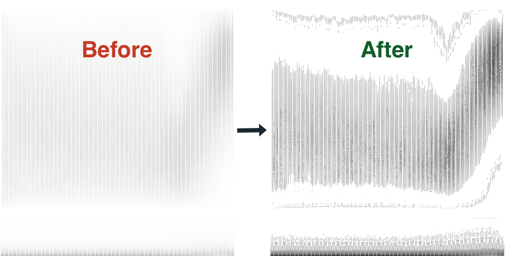
In the journey from data to meaningful patterns, one of our most critical steps is refining the visuals of our clusters. The default 'average' images of clusters that we initially generated provided a basic outline, but their readability was hindered by a key obstacle: the presence of numerous vertical lines. These lines resulted from the superimposed nature of individual stock chart images within each cluster, and they created a visual noise that obscured the more important areas of overlap.
To overcome this challenge, we adapted our approach to more prominently highlight the patterns in each cluster. We first eliminated the 'gray' background of the images, which primarily resulted from less frequent, individual stock movement patterns. This was achieved by setting a brightness threshold: pixels darker than this threshold were kept while lighter ones were turned white, effectively removing the gray background.
Next, we further emphasized the common areas within each cluster, where the overlapping of stock movement patterns was most frequent. This was done by computing a local average brightness, and highlighting areas that were darker than this average. Such areas represent the regions where most of the stock charts coincide, revealing the common patterns within each cluster.
The outcome of this process was a set of cluster images that clearly showcase the shared chart patterns of trades within each cluster. This visualization allows for a much easier interpretation of the clusters and their potential significance in stock market trends, paving the way for our subsequent analysis.
Before continuing our analysis, it's important to note that we'll be referring to terms and concepts related to Stock Cycles. These terms describe various stages in the life cycle of a stock, including stages like Accumulation, Markup, Distribution, and Markdown. These stages can help us understand the price and volume patterns we observe in our clusters. If you're unfamiliar with these concepts, we highly recommend reading this page on Investopedia about Stock Cycles. Equipping yourself with this knowledge will enhance your understanding of our analysis and enable you to better interpret the findings.
Average Cluster Image Results
The initial results from the clustering process reveal some intriguing findings. Here's a brief overview:
| Cluster | Average Gain (%) | Number of Trades |
|---|---|---|
| 0 | 1.51 | 2428 |
| 2 | 1.26 | 6806 |
| 1 | 0.58 | 8027 |
| 3 | -1.1 | 5048 |
| 4 | -1.5 | 2467 |
Cluster 0 : This cluster had an average gain of 1.51% and comprised of 2,428 trades. The positive gain indicates that stocks within this cluster generally are followed by an upward trend.
Cluster 2: This cluster also showed a positive average gain of 1.26%, albeit slightly lower than cluster 0. However, it contained significantly more trades (6,806), suggesting that patterns in this cluster were more common.
Cluster 1: The average gain of this cluster dropped to 0.58%, still positive but lower than the previous two. The number of trades was the highest at 8,027. This may suggest that these patterns are very frequent but less likely to yield high returns.
Cluster 3 and 4: Both of these clusters experienced a negative average gain of -1.1% and -1.5%, respectively. Cluster 3 included 5,048 trades while cluster 4 had 2,467 trades. This suggests that these patterns typically led to losses.
It's important to remember that these results are based on averages, and individual results within each cluster may vary greatly. While clusters with positive average gains are promising, the presence of clusters with negative average gains highlights the risks inherent in stock trading.
With these preliminary observations, let's dissect each cluster's distinct image patterns, as understanding the specific patterns associated with each cluster could help us better predict future stock performance.
In the following sections, we will be exploring each of these clusters individually, studying the average images and trying to identify any common characteristics or patterns. This, coupled with the data we have on average gains and number of trades, will help us to understand which chart types could potentially yield more favorable outcomes.
Analysis of Average Cluster Images
The average image for Cluster 0 initially reveals a steady and flat pricing trend that spans the majority of the image. This pattern is akin to a broad rectangle that takes up a significant portion of the image's height. It could indicate a stable period where the stock price doesn't show much volatility, which might be characteristic of a stock in the Accumulation stage.
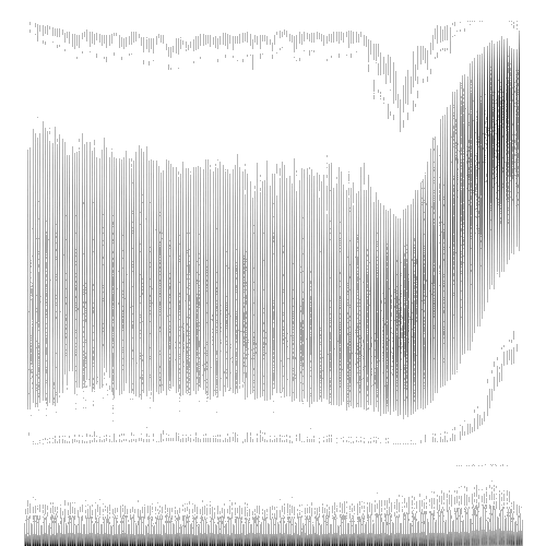
As we shift our attention towards the latter part of the image, the price action begins to tell a different story. The flat, rectangular formation tapers into a rising pattern, almost resembling an upward curving rectangle. The increase in price towards the right end of the image might suggest a bullish market sentiment for the stock or an optimistic outlook based on favorable financial performance or prospects. This shows characteristics of a stock entering the Markup stage.
In tandem with the price action, the volume section of the image also offers noteworthy observations. Initially, it stays quite consistent, correlating with the stability in price observed earlier. Yet, as we near the point where the price begins its ascent, we notice a corresponding surge in trading volume. An uptick in volume often signifies greater investor interest and can reinforce the validity of a trend. In this case, the rise in volume complements the upward price trend, potentially highlighting its strength.
The raise of the potential Markup stage is relatively low compared to the Accumulation stage. This could represent a stock in its initial leg of the Markup stage.
To sum it up, Cluster 0 appears to encapsulate stock charts that display a transition from a stable pricing period to a promising upward trend backed by increasing volume. These traits, coupled with the positive average gain this cluster has demonstrated, might suggest that stocks displaying this pattern could offer attractive trading opportunities. However, as always, it's important to consider such patterns in conjunction with other market indicators and thorough due diligence.
Continuing our analysis, the cluster that has the next highest average gains percent is Cluster 2 . Interestingly, this cluster shares certain traits with Cluster 0, though with some key distinctions.
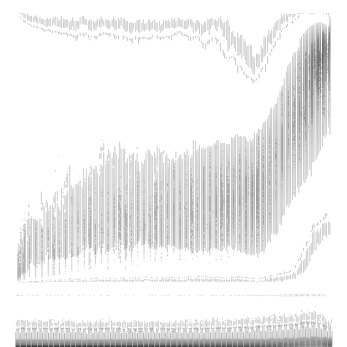
The left side of the average image in Cluster 2 has a more rounded appearance than the sharp, rectangular corner observed in Cluster 0. Additionally, the height of the 'flat rectangle' of the image is less pronounced than that in Cluster 0. The upward rising curve on the right side of the image seems to reach a greater height compared to the same region in Cluster 0.
In terms of the Stock Cycle stages, the patterns in Cluster 2 suggest characteristics of a stock in the more advanced legs of the Markup stage. This is when the price starts to increase as more investors buy the stock, anticipating future price rises. In contrast, Cluster 0 appears to represent stocks in the initial leg of the Markup stage, where the price begins its upward trend but has not yet gained substantial momentum. The distinction between these stages may be subtle, but understanding this can potentially provide significant insights for predictive analysis and trading strategy development.
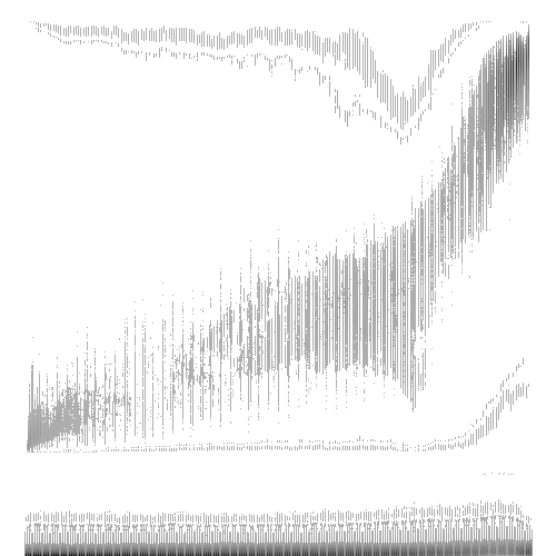
Moving on to Cluster 1 , which has an average gains of 0.58%, we see a continued upwards trend. However, the pattern in this cluster is less clear-cut than those observed in Clusters 0 and 2. Notably, the early to middle portions of the image exhibit more volatility, with areas appearing somewhat "choppy" - a term frequently used by traders to describe irregular or erratic price fluctuations.
Contrasting with Clusters 0 and 2, where the left side of the image remains predominantly flat, Cluster 1 displays a gentle rising gradient that steepens considerably towards the right side of the image. This suggests a pattern indicative of even more advanced legs of the Markup stage compared to Cluster 2. In other words, these stocks are potentially further along in the price appreciation cycle.
However, the relative lack of a pronounced pattern in Cluster 1 might indicate a less distinct grouping within this cluster. This less cohesive cluster suggests a wider range of performance within this group and could contribute to the lower average gains observed relative to Clusters 0 and 2. It reinforces the notion that more clearly defined patterns may be associated with more predictable outcomes, highlighting the value of our image clustering approach in identifying such patterns.
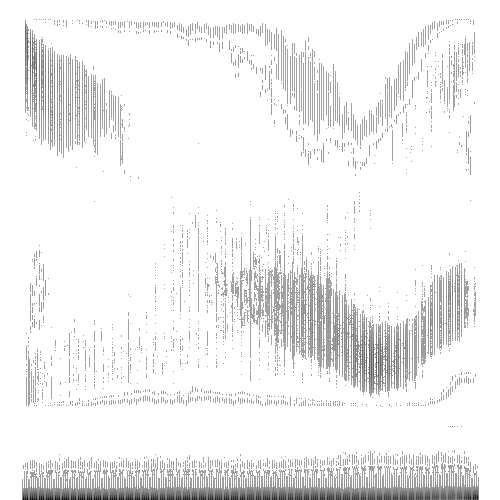
Diverging from the trends observed in the previous clusters, Cluster 3 , which has an average gains of -1.1%, presents a distinct pattern.
The pattern represented in this cluster's image reveals a downwards trend, a characteristic associated with the Markdown stage in stock cycles. There's an area within this pattern that lacks a clear shape, a phenomenon that might suggest periods of "chop," or volatile price fluctuations. The presence of such a zone could even point to gap downs, a term used in the stock market to refer to a company's stock opening at a lower level than the previous day's close, resulting in a break in the price chart.
Additionally, the image shows a pronounced upward trajectory towards its right side, deviating almost at a right angle from the preceding downward pattern. This abrupt shift could be viewed as a potential price reversal or bounce, often seen in stocks undergoing the Markdown stage. However, fresh off the Markdown sage, it is common for a stock to enter an extended Accumulation stage again. This stage typically signifies a phase where the stock price is relatively flat as it consolidates and often doesn't immediately lead to a sustained upward movement, which could explain the somewhat higher failure rate of potential breakout setups we observe from this cluster. In essence, the pattern may hint that, despite the sharp upward bounce, the market has not fully transitioned to the Markup stage. This suggests that careful analysis is needed when dealing with stocks showing similar patterns.
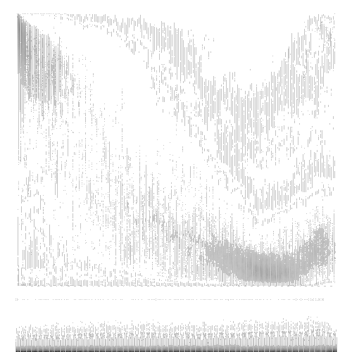
Last, and yes least, we have Cluster 4 with an average gains -1.5%. The pattern presented appears less clear when compared to the other clusters. In general, it bears some similarities to Cluster 3, especially with its overarching downward trend. However, the key distinctions lie in the less defined regions and a more subdued rise towards the right side of the image.
One interpretation could be that this pattern represents a phase where the stock market is transitioning, but the direction is not as assertive. The weaker uptick towards the right could imply a lack of strong bullish sentiment, suggesting a potential struggle between market participants.
Moreover, the vagueness of the pattern might indicate a less successful clustering for this group. This might suggest that the stocks within this cluster do not share as strong common characteristics, leading to a more indistinct average image. Such patterns underscore the need for nuanced interpretation when dealing with individual stocks or clusters that appear less clear-cut.
One fascinating observation from our clustering and analysis is the resemblance between the average cluster images and the different stages of the stock cycle. This correlation suggests that the stages of Accumulation, Markup, Distribution, and Markdown may well be reflected in these collective chart patterns.
In particular, it appears that stocks post-consolidation of the first leg of the Markup phase (as represented by Cluster 0) tend to yield the best performance. This finding suggests a potential correlation between specific stages, as well as certain legs of the Markup stage, of the stock cycle and subsequent performance, hinting at a promising avenue for further exploration.
However, it is crucial to underscore that these observations are still speculative at this point. While these preliminary findings are indeed exciting and encouraging, they serve as a launchpad for further, more detailed research. The ultimate goal is to validate these preliminary observations with more robust analysis and potentially uncover new insights into the nature of stock performance and its relationship to chart patterns.
Taking a Closer Look at Each Cluster
Taking a step further in our granularity, we've dived deeper into each cluster by further dividing them into two sub-clusters. The intention is to identify more distinct sub-patterns within the overarching shapes we've seen so far, which could offer additional insights into stock performance.
| Main Cluster | Sub-cluster | Average Gain (%) | Number of Trades |
|---|---|---|---|
| 0 | 0 | 1.97 | 1919 |
| 2 | 0 | 1.35 | 2981 |
| 2 | 1 | 1.19 | 3825 |
| 1 | 0 | 0.69 | 4355 |
| 1 | 1 | 0.44 | 3672 |
| 3 | 1 | -0.21 | 2753 |
| 0 | 1 | -0.26 | 509 |
| 4 | 1 | -1.48 | 2466 |
| 3 | 0 | -2.17 | 2295 |
| 4 | 0 | -29.74 | 1 |
A cursory glance at the data reveals some intriguing dynamics at play within each primary cluster. For example, within Cluster 0, which had the highest average gains, one sub-cluster appears to have a significantly higher average gains percent than the other. Another notable observation from the sub-clustering process is the solitary trade in Cluster 4, Sub-cluster 0, which showed a significant loss of -29.74%. While one might be tempted to read into this as an unusual or rare chart pattern, it could also signal an area of ineffective clustering in our current approach.
We should mention that our current sub-clustering approach is done mostly as a proof of concept. While it has offered some valuable additional insights, the implementation of a fixed number of two sub-clusters for each main cluster might not be the most effective. Future iterations of this research could explore varying the number of sub-clusters within each main cluster, capturing a more accurate and nuanced representation of the diversity within each primary cluster. This refinement in our methodology will hopefully lead to an even more comprehensive understanding of how chart patterns correlate with stock performance.
As we explore the sub-clusters in more detail, we aim to shed more light on these nuanced differences and better comprehend the diversity within each cluster's chart patterns and their impact on stock performance.
Cluster 0 Sub-clusters
Starting with the breakdown of Cluster 0, we find intriguing results. The two sub-clusters of this cluster present a significant disparity in average gains, a difference that outstrips all other clusters, barring Cluster 4, which we've identified as an anomaly.
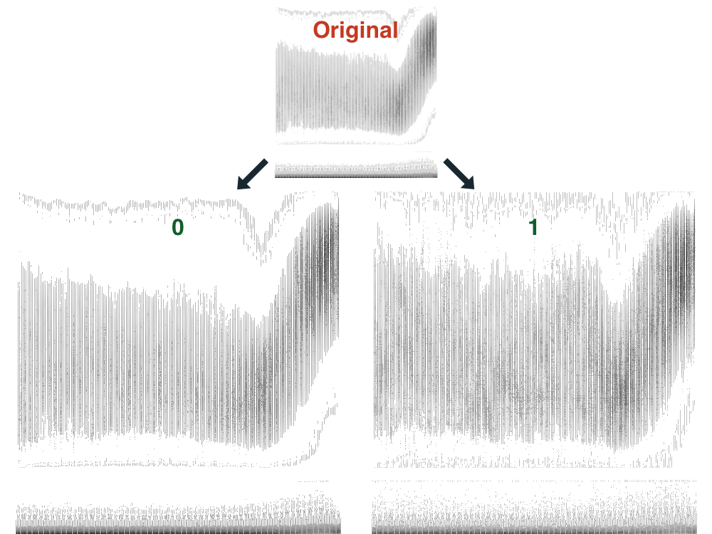
Sub-cluster 0 of Cluster 0 stands out with a remarkably 'clean' average image, characterized by well-defined contours. The identifiable regions of the image and their clear interrelations suggest a specific set of chart characteristics that might play a part in the stock's upward continuation. Moreover, this sub-cluster isn't just a theoretical exercise: it accounts for the lion's share of trades in Cluster 0, encapsulating 1919 out of 2428 trades.
In contrast, sub-cluster 1 seems to house more 'jagged' average images, with less defined areas, particularly in the upward movement region. This might be indicative of more irregular and potentially less predictable market behavior.
These findings are certainly exciting, hinting at a possible correlation between specific chart traits and subsequent market performance. While it's crucial to bear in mind that correlation does not imply causation, the sharp contrast between the sub-clusters within Cluster 0 suggests an intriguing line of investigation worth exploring further.
Cluster 2 Sub-clusters
Next we have Cluster 2, which is the cluster that ranked second in terms of overall average gains. With a comparatively smaller difference in average gains, we have 1.35% for Sub-cluster 0 and 1.19% for Sub-cluster 1. The trades in this cluster are also relatively evenly distributed: 2981 trades in Sub-cluster 0 and 3825 trades in Sub-cluster 1.
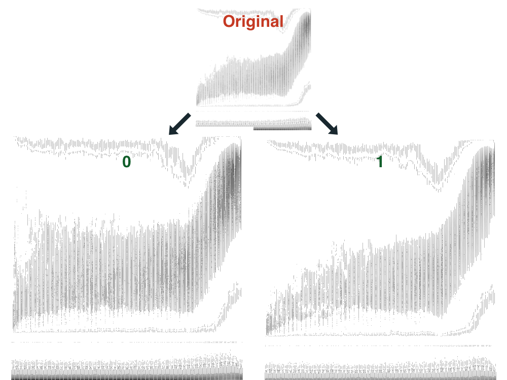
Taking a glance at the average images of each sub-cluster, certain differences are observable. Sub-cluster 0 presents a more rectangular shape on the left side of the image, coupled with a somewhat larger dark region at the top right side. Interestingly, these characteristics echo those found in the average images for Cluster 0, particularly, the successful Sub-cluster 0.
In contrast, Sub-cluster 1 displays an upward trend already taking place on the left side of the image. This suggests that the stocks represented here might be at a later stage of the Markup phase.
The marginally better performance of Sub-cluster 0 in Cluster 2 seems to support our previous speculation that stock setups at the earlier legs of the Markup phase could exhibit better performance. Nevertheless, given the small differences in the average gains and the shared characteristics between the sub-clusters, it's challenging to draw distinct conclusions at this point. As with previous observations, these findings underline the potential value of further investigation and refinement of our approach.
Cluster 1 Sub-clusters
Next in our analysis is Cluster 1, which has a minor difference in the average gains between its sub-clusters: Sub-cluster 0, containing 4355 trades, registers an average gain of 0.69%, while Sub-cluster 1, with 3672 trades, comes in at 0.44%.
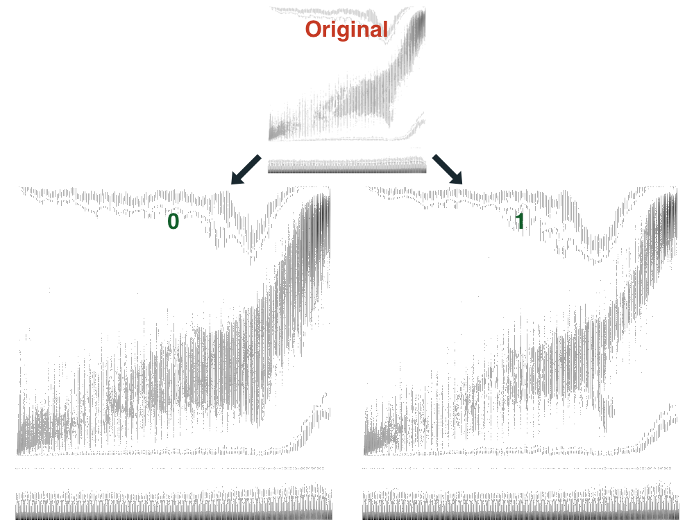
A closer inspection of the respective average images reveals that Sub-cluster 0 features a wider region of upward movement along with a larger dark area in the top right section of the image. However, apart from these distinctions, there aren't many stark visual differences separating the two sub-clusters.
It's important to highlight that Cluster 1 has the highest number of total trades among all clusters, tallying up to 8027 trades. This suggests a broad diversity of chart patterns within this cluster, making it an interesting candidate for further exploration and experimentation. Given this substantial volume of trades, we might consider testing a greater number of sub-clusters within Cluster 1 in future studies. The goal here would be to ascertain if more distinct groupings could be identified, potentially revealing more nuanced relationships between chart characteristics and stock performance.
Cluster 3 Sub-clusters
Examining Cluster 3, we observe a considerable discrepancy in average gains between its sub-clusters: Sub-cluster 1 has an average gain just below break-even at -0.21%, whereas Sub-cluster 0 shows a significant loss at -2.17%.
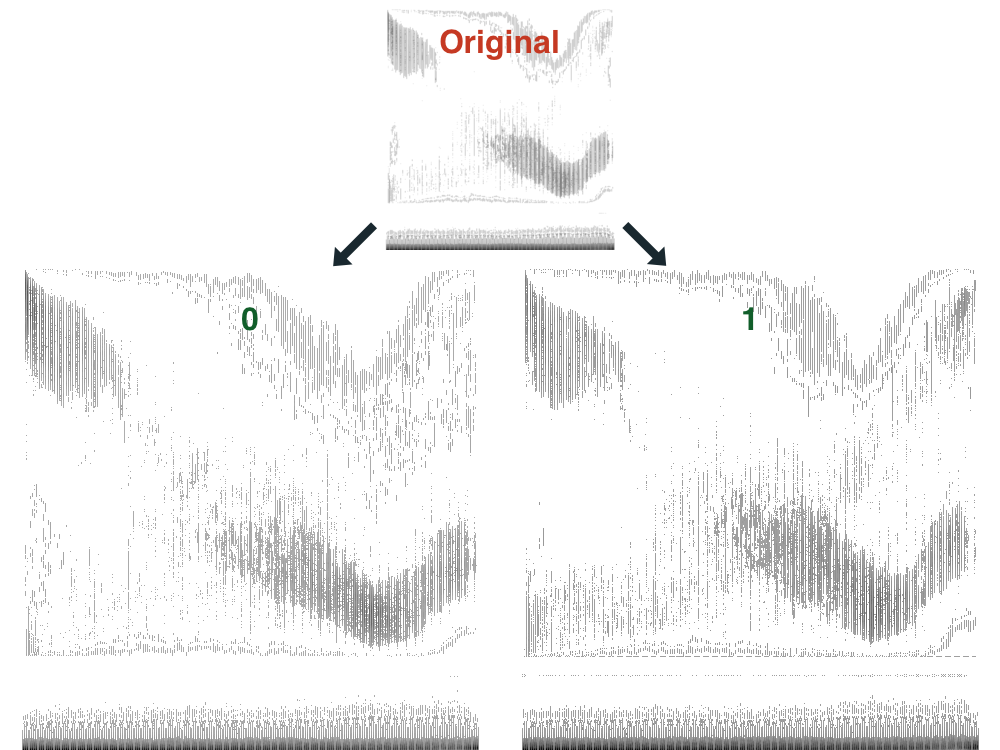
Taking a closer look at the respective average images of these sub-clusters, we note that both feature similar downward-trending regions. However, the image for Sub-cluster 1 demonstrates a higher prevalence of chart patterns indicating an upward trend, spanning from the bottom left to the top right of the image.
The more pronounced upward movement within Sub-cluster 1, compared to the average image of Cluster 3, illuminates the potential advantage of sub-clustering in our methodology. These distinctive characteristics might have remained unnoticed in the broader view, yet they emerged distinctly within this sub-cluster, highlighting the nuance and detail that can be captured through this more granular analysis.
This disparity within Cluster 3 suggests that our clustering process may not have been as successful here as it was with Clusters 0, 1, and 2. Yet, these findings provide useful insights into areas we can focus on for improvement in future refinements of our methodology.
Interestingly, these observations align with our earlier theory, suggesting that stocks with upward-trending chart patterns tend to display stronger continuation compared to those in a downward trend. These insights underscore the potential of our image-based analysis to uncover meaningful insights and promising avenues for further research.
Cluster 4 Sub-clusters
As we turn our attention to Cluster 4, we encounter a challenging situation with the sub-clustering process, as one sub-cluster consists of a single image. Despite the evident shortcoming, these results provide intriguing insights.
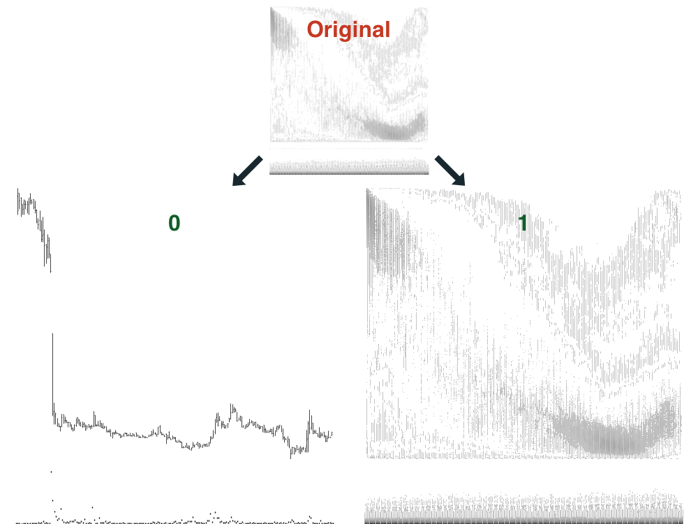
Remarkably, the unsuccessful clustering of this group correlates with its less defined regions in the average cluster image, affirming the complexity of interpreting such patterns. Similar to Cluster 3, Cluster 4 appears to be largely composed of stocks displaying downward movements.
This convergence in behavior prompts intriguing questions about the potential benefits of reconfiguring our approach to clustering. A promising area of exploration could be merging Clusters 3 and 4, and then subdividing them into three or more clusters. Such a strategy could possibly refine the granularity of the clusters and better capture the nuances within this group of chart patterns. As with all our findings, these observations suggest exciting paths for further research and refinement of our methodologies.
Thoughts on the Clustering Process & Results
Looking back on the clustering process and its results, we find a fascinating interplay between the number of sub-clusters, the differentiation in average gains, and the clarity of the average images. The process and outcomes of this exploration invite intriguing reflections and potential strategies for further refinement.
A key observation is that certain clusters, notably Clusters 0 and 3, seem to benefit significantly from being divided into two sub-clusters. The sub-clusters within these groups not only display notable differences in average gains but also distinct variations in their average images. This correlation between cluster quality and successful outcomes is certainly compelling, as it hints at a potential connection between cleaner, more defined chart patterns and more predictable performance.
In contrast, other clusters might have benefited from being divided into more than just two sub-clusters, or even from being reconfigured altogether. Clusters 3 and 4, for instance, both appear to predominantly consist of stocks exhibiting downward movements. Mixing these clusters and then dividing them into a larger number of sub-clusters might have produced more nuanced and potentially insightful results.
A particularly exciting aspect of this exploration has been the visualization of commonly used trading phrases in the form of average images. Terms like "clean movement," "more linear," and "clear momentum" are often used by traders to describe promising setups. To see these concepts reflected in our analysis, particularly in a way that correlates with performance, is quite intriguing. One standout example is Sub-cluster 0 of Cluster 0, which presented an image that cleanly outlines stocks appearing to be at the start of the Markup stage. This sub-cluster not only showcased the cleanest image but also boasted the highest average gains of 1.97%.
In conclusion, these findings underscore the promise of machine learning techniques in the interpretation and prediction of stock market behavior. They point to the potential for even more refined methodologies in the future and underscore the value of continual experimentation and analysis in this complex, dynamic field.
Conclusion
Summary
Throughout this study, we embarked on an explorative journey into the world of financial chart patterns and their correlation with stock performance. By implementing a data-driven approach, we used machine learning techniques, specifically clustering, to categorize different stock chart patterns and their subsequent performances.
We began by analyzing five broad clusters of chart patterns, each representing an amalgamation of numerous individual stock charts. The clusters illustrated distinct patterns that interestingly bore resemblances to the different stages of the classic stock market cycle, namely the Accumulation, Markup, Distribution, and Markdown stages.
Our results showed varied performance levels across different clusters and their corresponding sub-clusters, hinting at a potential relationship between chart shapes and stock performance. Notably, stocks within clusters representing what seemed to be the initial stages of the Markup phase demonstrated a higher average gain, lending credence to popular stock market theories.
While our results have been encouraging, it is crucial to note that this research is preliminary. While some clusters' sub-clusters showed significant differences in performance and visually distinct patterns, others didn't present as clear-cut results. However, these findings have provided an intriguing starting point and paved the way for further, more refined studies in this area.
Future Work
The findings of this study have opened up several exciting avenues for further research. The clear correlation between the visual attributes of the chart patterns and their performances paves the way for a more in-depth exploration into the specifics of these characteristics.
Further Refinement of Clustering : The results have suggested that some clusters may benefit from a more granular division into sub-clusters, while others might perform better if amalgamated before being re-divided. Future work could focus on optimizing the number of clusters and sub-clusters to enhance the effectiveness of this method.
Exploring Other Machine Learning Techniques : In addition to clustering, there are many other machine learning techniques, such as convolutional neural networks (CNNs), that might prove effective in identifying and classifying chart patterns.
Temporal Analysis : This study focused on the shape of chart patterns without considering the time aspect in depth. Future studies could explore the role of duration in the stages of stock market cycles and their correlation with performance. One measure of this might involve studying instances when the Simple Moving Average over 10 days (SMA10) is above the SMA over 20 days (SMA20), and the SMA20 is above the SMA over 50 days (SMA50) for the QQQ. This could help us identify the effect of broader market trends on individual stock performance and cluster behavior.
Scans Based on Chart Patterns : A fascinating future endeavor could be to use this specific sub-cluster, or even a single stock chart, as a reference, seeking to identify similarly shaped setups programmatically. By effectively turning the research process on its head, we might develop an innovative method to scan for chart setups based on visual similarity.
Developing Predictive Models : Once more robust and precise classifications of chart patterns are established, the ultimate goal would be to develop predictive models. Such models could help forecast future stock performance based on the identified characteristics.
This work serves as a launchpad for a more in-depth exploration of the intricate relationship between chart patterns and stock performance. The horizon for future work in this area is vast and ripe with opportunities to advance our knowledge and predictive capabilities in this fascinating intersection of finance and machine learning.
Invitation to Collaborate
We recognize that knowledge creation is a collaborative process, and we highly value the insights and perspectives of our broader community. Therefore, we are pleased to extend an open invitation for anyone interested to join us in this exciting journey of discovery and analysis.
For real-time discussions, we encourage you to join our Discord server and participate in the ongoing conversation on our subreddit. You can also engage with us on Twitter. Please feel free to share your thoughts, insights, and ask questions about the research and findings presented in this report.
In the spirit of open science and to facilitate further exploration, we are happy to provide access to all the trades, stock chart images, and even the PDF version of this report. All of these materials can be downloaded for free from our product page.
If you are interested in replicating or extending this study, you can find the necessary resources in our GitHub repository. Your contributions are highly welcomed, whether in the form of filing issues or even making pull requests.
We would like to express our heartfelt gratitude to the community for their support and feedback since the release of our last study. Notably, we want to give a special shoutout to a few individuals whose discussions and insightful contributions have been particularly invaluable in guiding the direction of our future studies. They are Blaxer (Discord), Dolivent (Twitter), Dragonslayer (Twitter), Simonh (Discord), and Whos_Agent (Twitter). We are immensely grateful for their constructive feedback and thoughtful conversations.
Your participation, support, and collaboration are crucial in advancing our shared understanding of the stock market. We look forward to your insights and contributions, as we continue on our quest to understand the multifaceted dynamics of data-driven stock market analysis.